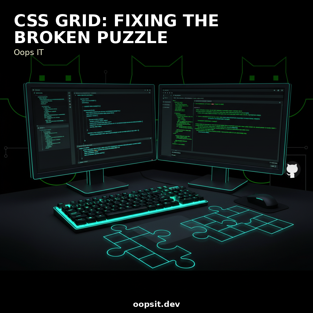
My CSS Grid Nightmare: Fixing the Jigsaw Puzzle
Okay, so picture this: it was my first time diving headfirst into CSS Grid. I'd seen all these slick demos, heard the buzz, and thought, "Easy peasy, right? Just gonna whip up this awesome responsive...
r5yn1r4143
Apr 16
Okay, so picture this: it was my first time diving headfirst into CSS Grid. I'd seen all these slick demos, heard the buzz, and thought, "Easy peasy, right? Just gonna whip up this awesome responsive layout in no time." Famous last words, am I right? I was building a simple product listing page, aiming for a neat 3-column grid on desktop, stacking to 2 columns on tablet, and a single column on mobile. Seemed straightforward. I’d meticulously planned the HTML, sprinkled in some basic CSS, and then… BAM. My beautiful grid looked less like a professional design and more like a toddler’s art project after a sugar rush. Items were overlapping, some were just… floating off into the void, and the alignment was so off, it felt like it was actively mocking my efforts. My browser console? Silence. No glaring red errors, just the quiet hum of something deeply, fundamentally wrong. It was the digital equivalent of tripping on a perfectly flat surface.
TL;DR: The Grid Gremlins Ate My Layout!
If your CSS Grid looks like a broken jigsaw puzzle, don't sweat it. It usually comes down to a few common culprits: missing display: grid;, incorrect grid-template-columns or grid-template-rows definitions, misunderstanding grid-gap vs. gap, or content overflow issues. This post walks you through my epic fail and how I wrestled those gremlins into submission, covering not just the code but also the mindset shifts needed for effective web development.
The "Oops, My Grid is a Mess" Moment
I remember staring at the screen, my carefully crafted HTML structure seemingly ignored by CSS Grid. My div elements, meant to be neat squares in a perfect arrangement, were sprawled across the page like they’d had a bit too much to drink at the office Christmas party. Some were squished, others stretched, and there was this gaping, awkward whitespace where things were supposed to align. My initial CSS looked something like this (and yes, this is a highly simplified version of my actual, likely more chaotic, first attempt):
<div class="product-grid">
  <div class="product-item">Product 1</div>
  <div class="product-item">Product 2</div>
  <div class="product-item">Product 3</div>
  <div class="product-item">Product 4</div>
  <div class="product-item">Product 5</div>
  <div class="product-item">Product 6</div>
</div>
.product-grid {
  / I thought this was enough... oh, how naive I was. /
  width: 90%;
  margin: 0 auto;
}.product-item {
  border: 1px solid #ccc;
  padding: 20px;
  text-align: center;
}
My mental image was a 3-column layout. I was expecting Grid to automatically figure things out. Spoiler alert: it doesn't. It needs instructions. My biggest mistake? I hadn't actually told the container to be a grid. It was just a div with some basic styling. The browser was rendering it as a block-level element, stacking them vertically by default, and my attempt at column-like behavior was nonexistent.
Hunting Down the Grid Gremlins: The Usual Suspects
This is where the real debugging detective work began. I started systematically checking off the common CSS Grid pitfalls.
Gremlin #1: The Missing display: grid;
This was my primary offender. Without display: grid; on the parent container (.product-grid in my case), none of the other Grid properties would do anything. It's like having a fancy recipe but forgetting to turn on the oven.
The Fix: Add display: grid; to your container element.
.product-grid {
  display: grid; / Ta-da! Now it's a grid container. /
  grid-template-columns: repeat(3, 1fr); / Aiming for 3 equal columns /
  gap: 20px; / Spacing between items /
  width: 90%;
  margin: 0 auto;
}.product-item {
  border: 1px solid #ccc;
  padding: 20px;
  text-align: center;
  / Add some min-height to visualize alignment better /
  min-height: 150px;
  background-color: #f9f9f9;
}
When I added display: grid;, things immediately snapped into a 3-column layout. It was magical! But it wasn't perfect yet. Some items were still weirdly spaced, and the alignment was a bit off.
Gremlin #2: grid-template-columns and grid-template-rows Shenanigans
My next headache was how I defined the columns. I initially thought repeat(3, 1fr) was the silver bullet. It's great for equal columns, but what if your content varies? Or what if you want different column sizes?
Problem: Content overflow causing unexpected layout shifts. Sometimes, a long product name or a particularly large image could push its container wider than expected, messing up the 1fr distribution.
Problem: Not defining grid-template-rows can lead to rows stretching to accommodate the tallest item, which might not be what you want.
The Fix: Use auto-fit or auto-fill with minmax() for responsive columns, and consider grid-auto-rows or explicit row definitions if needed.
For responsiveness, repeat(auto-fit, minmax(250px, 1fr)) is your best friend. This tells the grid to create as many columns as can fit, with each column being at least 250px wide but growing to take up an equal fraction (1fr) of the remaining space.
.product-grid {
  display: grid;
  / Responsive columns: at least 250px, grow to fill space /
  grid-template-columns: repeat(auto-fit, minmax(250px, 1fr));
  gap: 20px;
  width: 90%;
  margin: 0 auto;
}/ ... rest of the CSS ... /
This made the layout automatically adjust based on screen width. On smaller screens, it would gracefully stack into fewer columns.
Gremlin #3: gap vs. grid-gap and Alignment Woes
I might have used grid-gap (the older syntax) or just not understood how gap worked.
Comments
Sign in to join the discussion.